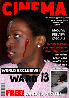
It was very good to see that from the audience feedback that the Ward 13 film poster was being compared with other movie posters. With the help of formats such as Photoshop, it is very possible to design something making it look real.
It was very good to see that from the audience feedback that the Ward 13 film poster was being compared with other movie posters. With the help of formats such as Photoshop, it is very possible to design something making it look real.
Posted by Hannah Ajala at 13:41 0 comments
Whilst filming, we made sure to have as much footage as possible, so that there would be a variety to choose from. We then chose the best bits of footage and began editing on iMovie HD;
 iMovie was quite easy to use as it could a range of things such as organising, editing, sounding and cutting parts of each clip. It was also very reliable to use as if you accidentally deleted a clip, you could click on 'undo' and the clip would re-appear.
I used Final Cut Pro to do the special effects, sounds and the 'complicated' things. I was lucky enough to have this software of my personal computer so it was easily accessible and I could have more time to work on it.

Posted by Hannah Ajala at 13:06 0 comments

We chose the name 'Cinema' for the movie magazine which is very suitable for any genre movie, it doesn't necessarily have to be a horror movie magazine because just by looking at the photo, the reader could tell straight away what genre.
We used quite an effective picture taken from the movie for the magazine cover to freak out the reader a bit.
We already had some experience of magazine covers as from year 12 work, we learnt the basic things needed on a front cover;
A big, bold title
A main use of colours e.g. cinema - red,white and black [like NME]
A lot of text/ information luring the reader to buy the magazine!

Posted by Hannah Ajala at 12:37 0 comments
We still stuck with the creative film company name 'Light Scream', btu we thought that the design was a bit bland and needed to be improved so we ended up with this design which was much better
Photoshop was a very helpful device to improve the look of the film company on the movie poster. By looking at this alone, it would definitely look like it belongs on a film poster
Posted by Hannah Ajala at 01:56 0 comments


Posted by Hannah Ajala at 01:34 0 comments
Labels: http://1.bp.blogspot.com/_YNAZHz1-Tq8/TOOwSaeyGUI/AAAAAAAAAmU/eFxTCR-EFYs/s320/LetMeIn.jpg
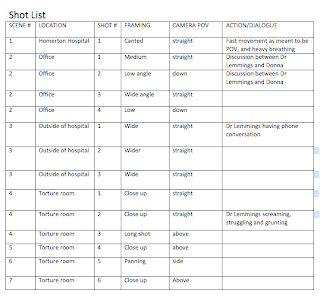
With the help of the action planning sheet we were given in class, we were able to organise WHEN we would be filming, WHO would be needed, WHERE it was and WHAT would be needed.
The first filming we did was the 'Torture room' scene which was the last bit of the trailer but since it was easily accesible to film at, that is why we decided to film there first. Me and Eleona took turns whilst filming and it went well. The main character, Doctor Lemmings was obviously needed for this part.


The second part of filming we did took place in Homerton Hospital; where the film is based on. David (Doctor Lemmings) and Myself were needed for this part and Eleona was the camera person. This part of the trailer is very chilling for the audience as the 'dead patient' appears to haunt Doctor Lemmings.

The third part of filming was the 'office' scene when Doctor Lemmings is informed by co-worker Donna, that his favourite patient Maya has died. This part of the scene contains dialogue and basically tells a bit of the content of what has happened and explains the storyline. Every word in a trailer counts - especially the trailers we see today that can last up to 20 seconds. Me and Eleona both filmed as I playing Maya wasn't needed in this scene.


[To see all filming pictures please click on following link]
Posted by Hannah Ajala at 09:36 0 comments

Posted by Hannah Ajala at 09:36 0 comments


We found it quite enjoyably making up our own film company name since I knew a lot of groups in our class would most probably use the company 'Twisted Pictures', so it was good for us to do something different. We chose the name 'Light Scream' as there is something quite mysterious about the name and it suits the introduction of a horror movie trailer.
Posted by Hannah Ajala at 06:16 0 comments

Posted by Hannah Ajala at 05:43 0 comments
 We chose to make our film a 15. This would mean that anyone over 15 years old can legally watch, so we have already limited our audience. However, our core audience is 15-28 year olds and the secondary is 28-38 years old. We should be able to reach a large audience, which would help to maximise publicity.
We decided to have the certificate as 'TBC' as it doesn't necessarily target a certain age group - it targets a range of adults
Posted by Hannah Ajala at 07:27 0 comments
The organisation of this film trailer really had to be precise and the work had to be efficient. We made sure that we knew the days of filming, what we would be doing on these days, what would be needed, and we also set ourselves targets.
Posted by Hannah Ajala at 03:27 0 comments
